

In a broader approach than just automatically resizing display dimensions across multiple devices, the technique of Responsive web design requires a more logical and conceptual way of thinking. For example, how to deal with the difference in content organization between a landscape and a portrait layout? In today’s market, more devices with a diversity ratio are launched. Is there any formula to enable switching among different orientations automatically based on the user’s whim? We will discuss more in this article.
What is Responsive Web Design?
Responsive Web Design (RWD) refers to a practice in web design that supports modifying on-screen display arrangements elastically among devices with a variety of dimensions. This practice ensures an aesthetic, consistent, and intended on-screen presentation of layouts, texts, and images. These elements will be arranged responsively along with appropriate resolutions across specific devices such as desktops, tablets, or smartphones, etc.
The 3 key features of a Responsive Web Design
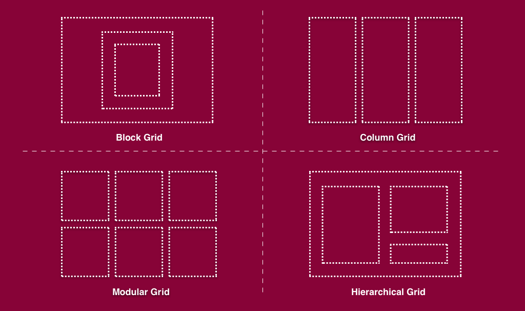
1 ) Fluid Grid – Automatically fit across devices. The implementation of Fluid Grid design acts on the alignment concept, a basic principle of design. The grid-based design allows web designers to separate the layout into multiple columns and rows. This function also simplifies the design by offering custom arrangement and alignment tailoring to content. The grid behaves responsively corresponding to the available screen width to ensure a smooth user experience on each device.Basically, the grid acts based on a harmonious workflow between CSS and percentage. A fluid grid is created using CSS. Later on, the columns will be able to resize automatically to fit the screen interface, whether users are using a 14-inch laptop, an 8-inch tablet, or a 6-inch mobile phone.
Grid makes use of percentages as an alternative to pixels are integers that web designers have to modify manually. Meanwhile, percentages are relative measurement units that allow adjusting the size proportionally to various displayed dimensions across the mediums. This means no matter what your device dimension is, the web layout can adjust flexibly (upon the percentage) and automatically (thanks to CSS) itself. In order to define a flexible grid, the following elements are important to concern:
- Columns, Rows, and Sizes within the Grids
- Vertical and Horizontal gaps, spacing between the grid elements.
- The flow algorithm when there is any newly added element.
Nevertheless, most existing grid systems in fact restrict the application of CSS classes that define size, space, and alignment. Overusing these layers on a responsive web design can cost time and make it more complicated instead of coding your own.
2 ) Flexible Visuals – Image is another essential component of a website. To make the website fit completely with the screen size, along with content, the visual also must be flexible. This means there are certain commands to limit visual spaces on smaller devices.To prevent images from exceeding their containers and adjust their size proportionally when shifting to smaller interfaces, web designers can simply crop them with CSS. The CSS overflow property allows designers to crop the image flexibly and load it appropriately to the screen size.
3) Media queries – Media queries allow the website to detect the user’s device type to present a suitable proportion to the screen. With media queries, it supplies designers with building multiple layouts based on user-side display parameters. For example, media queries deal with the browser display’s size, page orientation (portrait or landscape), colors and resolutions, etc. Most people prioritized media queries as the main component of a responsive web design. However, the fact is media queries operate smoothly only if there is an existing implementation of fluid grids and flexible images. Substantially, the query comprises of two-element: a media type with expressions that check the condition of distinct media features of a device. This is why media queries go beyond determining the device type since they also inspect the physical characteristics of the device.
The Advantages of Responsive Web Design
Save Maintenance Cost
Having a Responsive Web means there is one consistent version that runs compatibly across the devices. Therefore, if there are any bugs or new versions to fix and upgrade, web designers will only need to proceed with them once. If your website has two versions on desktop and mobile, the upgrading cost and maintenance might be double.
Effective SEO and Content Management
RWD provides only one URL, which reduces the SEO cost while enhancing its effectiveness. Additionally, it is also feasible and time-saving for uploading and managing content.
Build consistent Brand Awareness
One of the essential elements of Branding is consistency. RWD allows the web to runs consistently across the devices, which ensures consistency in branding presence and identity in the eyes of audiences, thus enhancing brand awareness.
Utility in Manipulation
The unity of UI provides more user-friendly browsing and navigating actions on the website. Thus, this leverages the UX and triggers users to explore longer on your site.
Optimize Page Speed
Complex effects and slides might cost time to process and load page data. RWD satisfies the users’ impatience by compressing the files and offloading heavy data, which speeds up the loading time.

The Challenges of Responsive Web Design
Time-consuming at the beginning phase
An implementation of a website responsive design will focus more on techniques and designing tasks at the beginning phase. The preparation for different scripts to meet specific requirements is a time-consuming process. Yet, similar to operating a company, well-structured flows at first will deliver smoother and more efficient workloads for long-term use.
Reduce the value of communicating messages
By cutting down on the image sizes or constraining the display of some information, RWD might decrease the meaning of delivered messages. Thus, there will be a requirement for designers that own such subtle aesthetics to arrange the layout and CSS as well as present the best visual tailoring to every screen browser.
Over-layered Navigation Bar
A neat and logical navigation bar is essential to keep users feel eager to explore on-site. If the navigation bar overuses layering, it will cause hassle for users when browsing on mobile devices. A convenient navigation bar is also a factor web designers should consider when designing UI on small mediums. Practice makes perfect as nothing is perfect from the first draft. An iteration of testing and adjusting will enlarge the use cases and apply them to optimize the design on multiple devices. A good Responsive Web Design service should offer a balance between simple design and user-friendliness in browsing information